Agile Training Center
Building a brand identity focused on comprehensive physical training
Overview
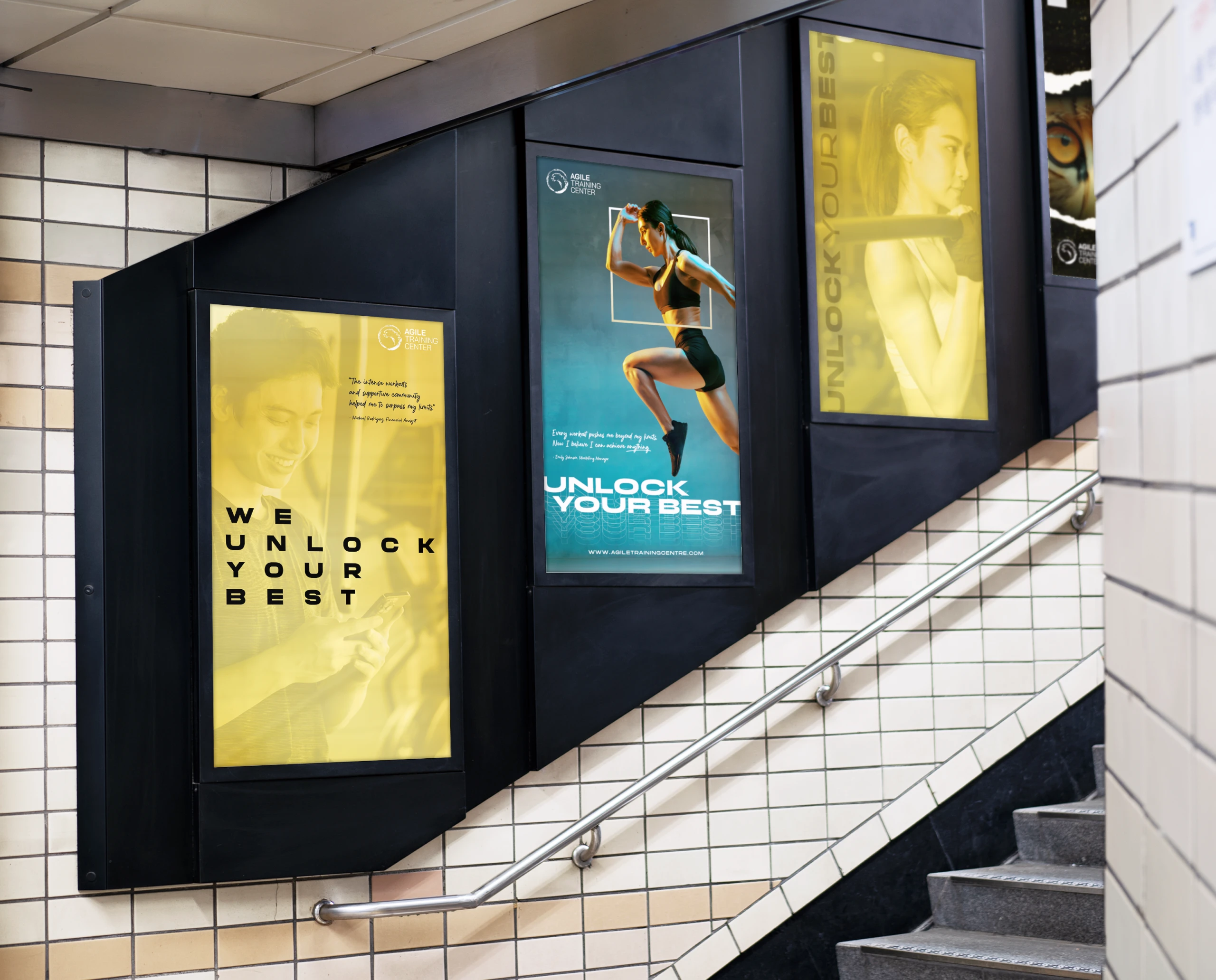
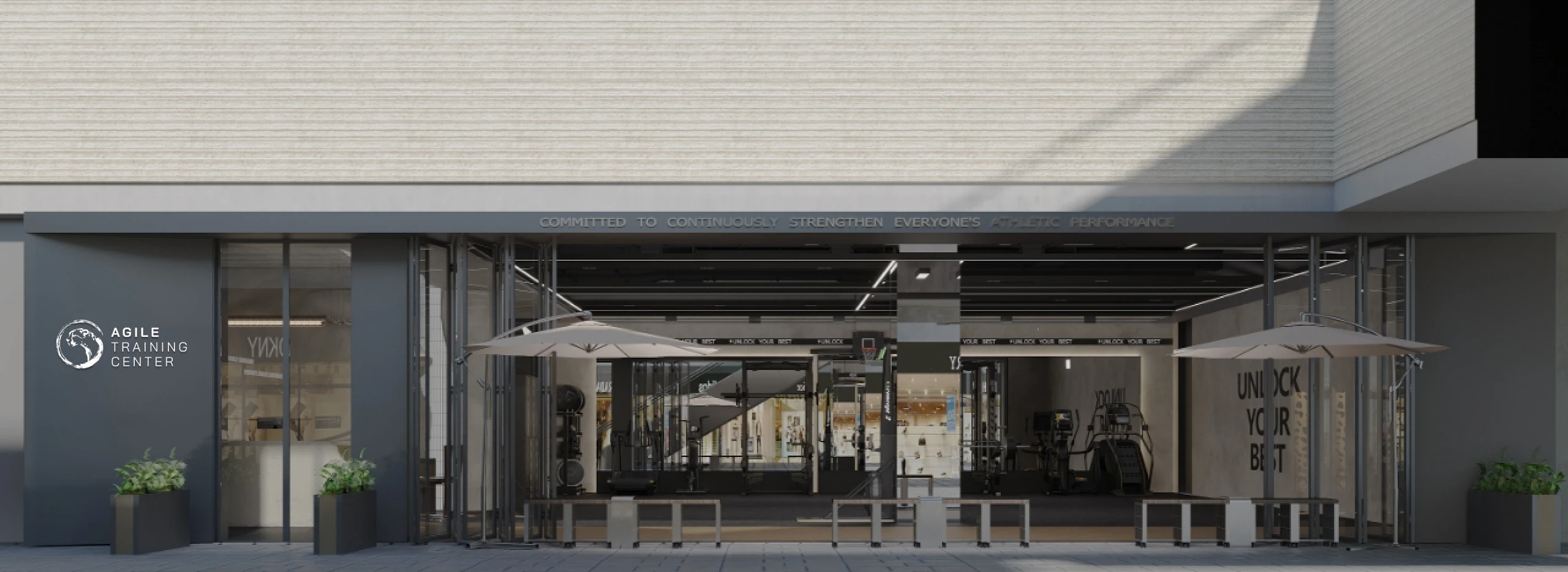
Agile Training Center is a premium training brand focused on functional and comprehensive physical training.
The project is built around the concept of ”Agility”, moving beyond the conventional gym narrative centered on raw strength and confrontation.
Instead, the brand emphasises body control, mental engagement, and the integration of movement and mind, shaping a contemporary training identity with cultural depth and long-term value.
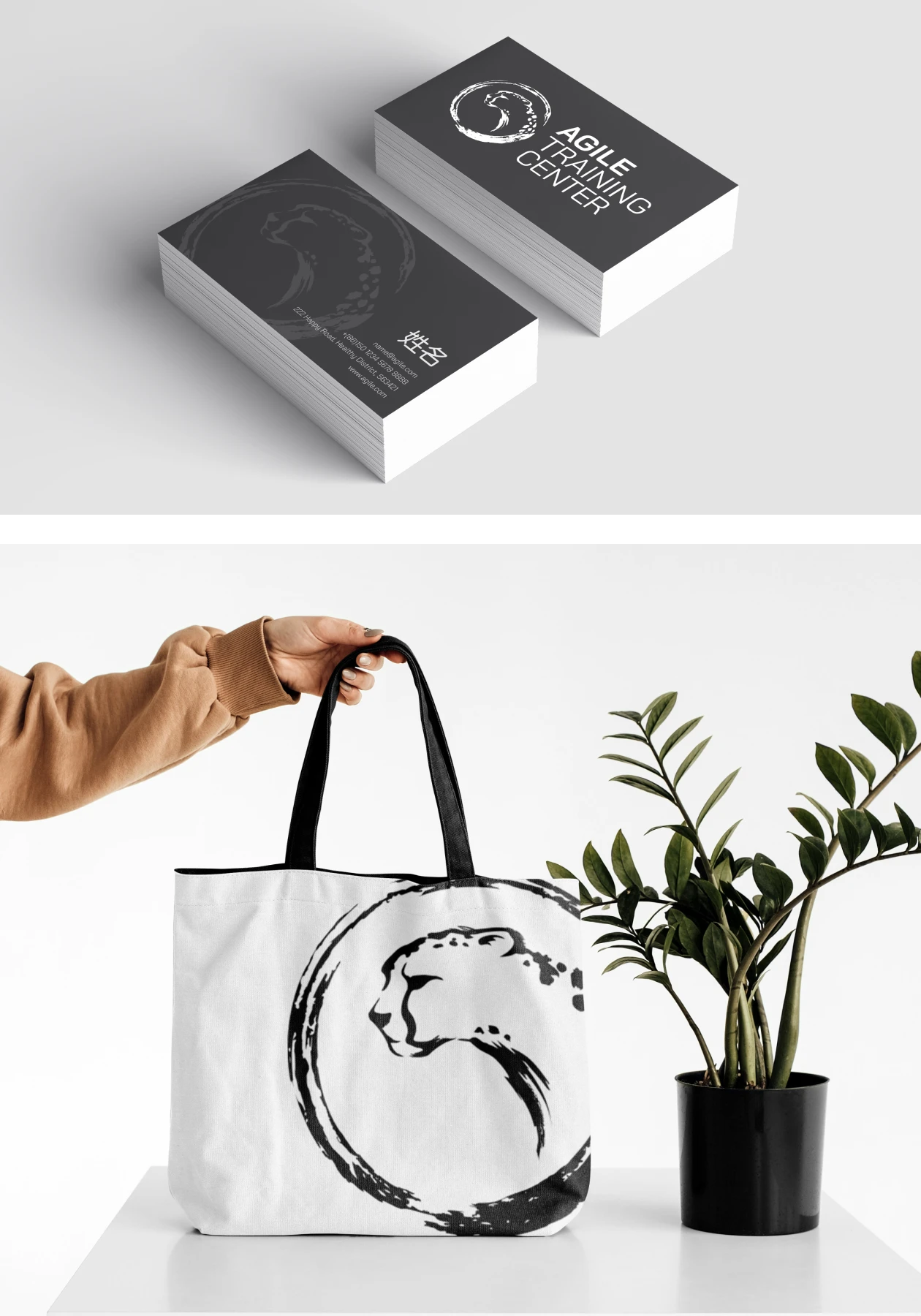
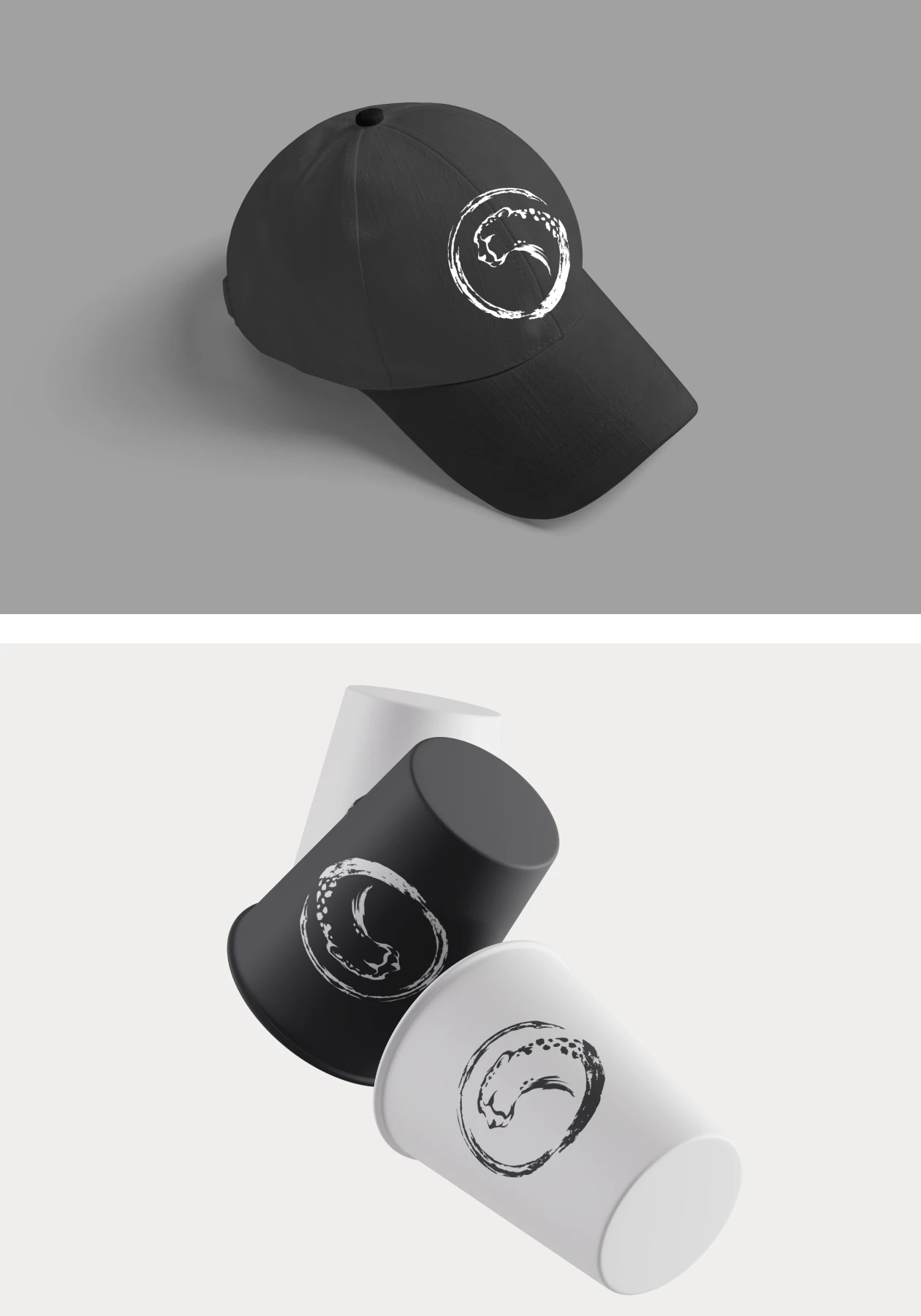
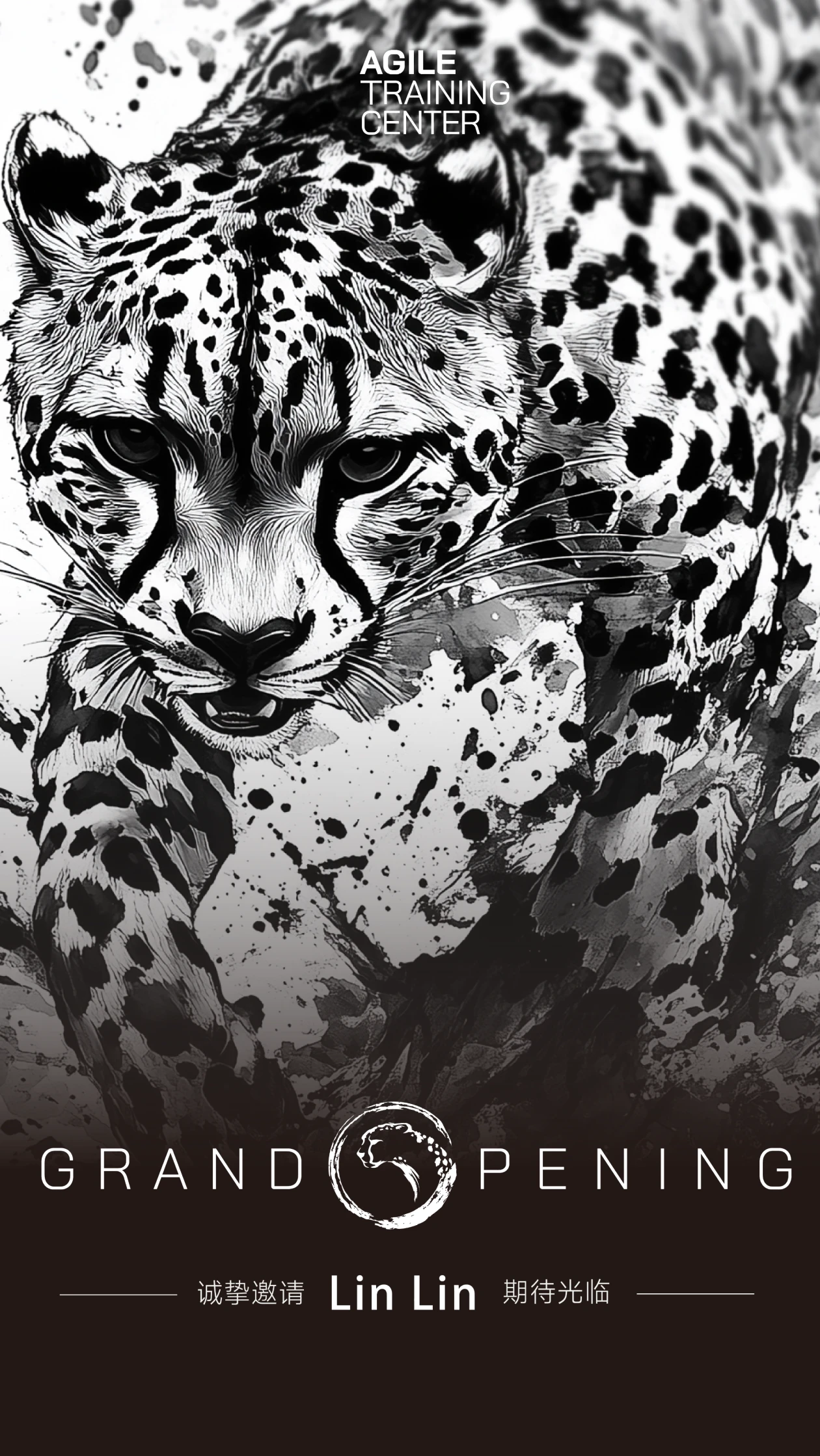
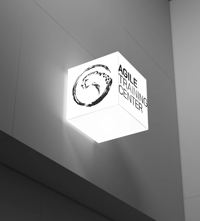
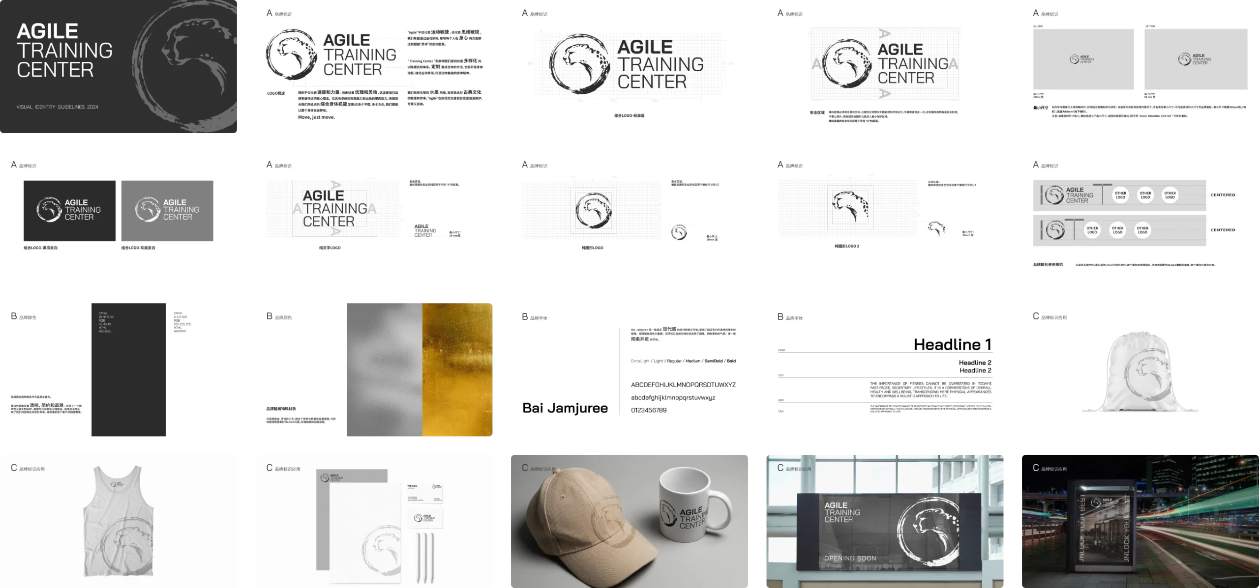
Logo Design
The logo is based on an abstract, dynamic form that integrates strength, speed, and fluidity.
Its structure emphasizes continuous motion and multi-directional movement, representing physical adaptability and precise control.
The mark balances energy and restraint, reinforcing the brand’s core belief in agility over brute force.
Its structure emphasizes continuous motion and multi-directional movement, representing physical adaptability and precise control.
The mark balances energy and restraint, reinforcing the brand’s core belief in agility over brute force.
Colour Palette
Monochrome tones establish clarity and elegance, forming a strong yet neutral canvas for the brand.
This flexibility supports a wide range of applications and reflects the brand’s emphasis on personalized training and individual needs.
This flexibility supports a wide range of applications and reflects the brand’s emphasis on personalized training and individual needs.
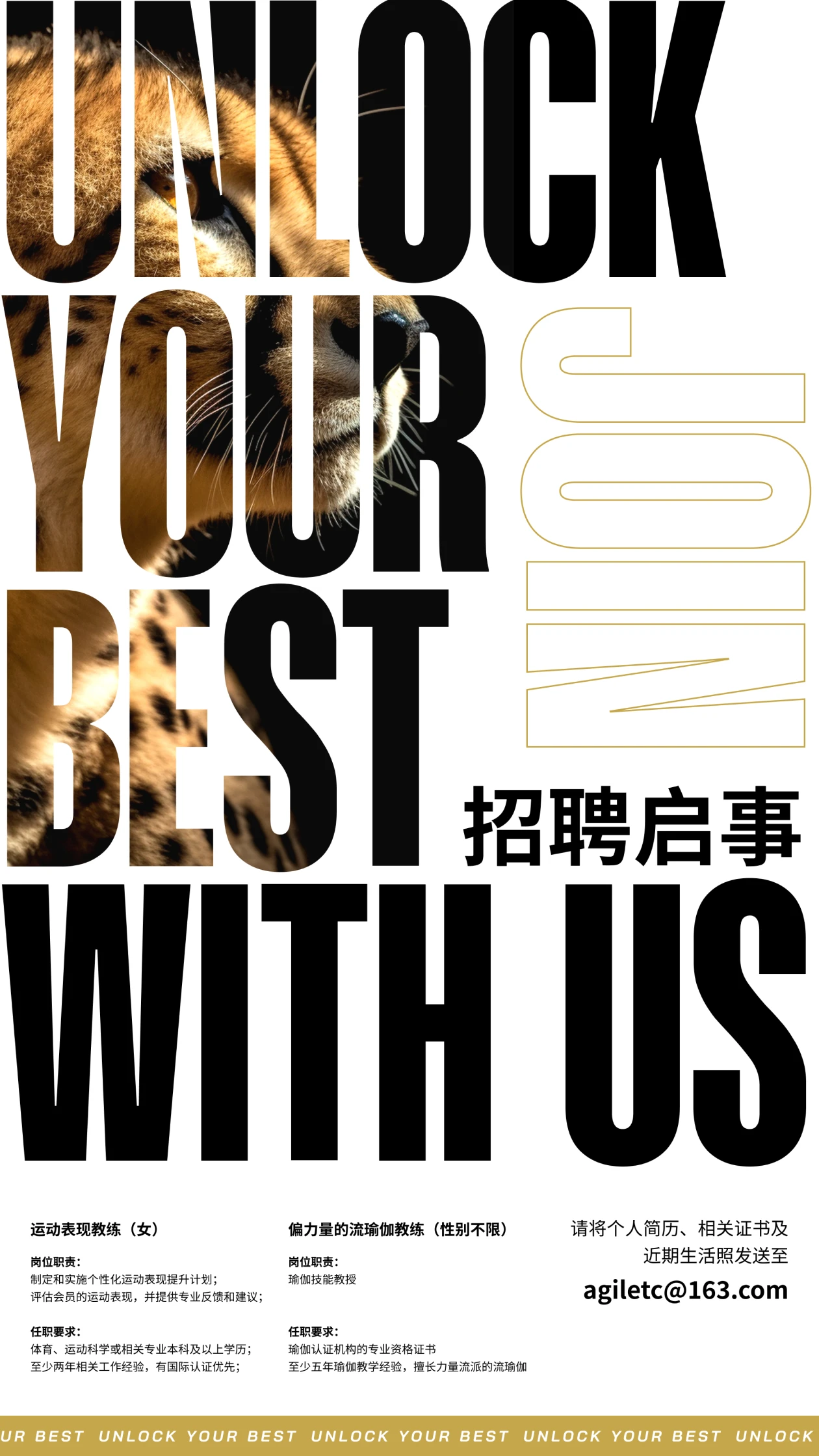
Typography
Sharp lines establish a confident, powerful presence, while rounded transitions introduce balance and refinement.
The typeface embodies a duality of firmness and fluidity, aligning with the brand’s focus on agility and controlled performance.
The typeface embodies a duality of firmness and fluidity, aligning with the brand’s focus on agility and controlled performance.

Brand Concept
The logo development began with the concept of Agility — interpreted not only as speed, but as control, adaptability, and mental clarity.
Rather than representing strength in a literal or aggressive way, the focus was placed on movement quality and multidimensional physical performance.
Rather than representing strength in a literal or aggressive way, the focus was placed on movement quality and multidimensional physical performance.
Form Development
The logo development began with the concept of Agility — interpreted not only as speed, but as control, adaptability, and mental clarity.
Rather than representing strength in a literal or aggressive way, the focus was placed on movement quality and multidimensional physical performance.
Rather than representing strength in a literal or aggressive way, the focus was placed on movement quality and multidimensional physical performance.
Refinement & Final Mark
The final mark achieves a balance between energy and restraint, aligning with the brand’s focus on controlled movement and agility.
Its concise structure ensures strong recognition and adaptability across both physical and digital environments.
Its concise structure ensures strong recognition and adaptability across both physical and digital environments.